
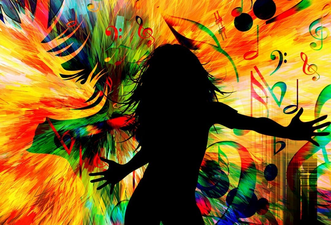
Color is one of the most important ways through which we perceive the world around us. Culturally speaking, we’ve always associated concepts or events with color or even feelings ― which is why happiness is usually seen through warm colors like red and orange and cool tones reflect calmness or sadness.
The world is more than black and white, and the colors we see in our homes or cities can considerably affect our mood. That’s why many cities receive a new design that includes more greenery and less modern grays. Greenery is associated with harmony, comfort, and even growth.
If you are in need of a change of scenery, you may start adding specific colours to your home to embody a certain feeling, or you may notice how certain colours can help you have better productivity at work. So let’s break down color neuroscience.
How can color affect mood at home?
If you’re often feeling tired, overwhelmed or simply cold at home, you may consider painting the walls and changing the décor because they can improve your mood. Blue bedrooms, green kitchens, and beige living rooms can bring more balance into your life than you’d think.
The color blue is great for helping you sleep because it has calming effects on the brain. Green in the kitchen will help you relax, which is essential when cooking or gathering around the table with family and friends. A beige living room offers enough warmth and balance for the room to welcome any visitors.
If you’re considering Feng Shui, most walls should be either cream, beige, or white, as they help create energy. However, other colors are not to be ignored. You can introduce them by painting one wall a shade of green and introducing greenery to create the most calming room in the house.
How can color help you learn better?
Whether you’re a student or want to be better at work, you may want to benefit from the effects of colour on memory. The brain perceives color better than black and white and automatically associates it with a concept or an object.
Colours like red and orange are ideal for highlighting signal key concepts and remembering crucial information, while yellow is great for stimulating the mind. So, you can take advantage of bright colors to improve memorization and recall, especially through color combinations.
That’s why more offices introduce a thoughtful colour combination that can support employee focus and productivity. Blue accents are great for focus in collaboration spaces, meeting rooms, or research areas. On the other hand, green creates a sense of calmness, so it’s efficient in individual desks, lounges, or designated relaxation areas. Areas with high activity, such as cafeterias and hallways, require bright red for confidence, while yellow is perfect for spaces where creativity should flow.
How can colour be used in therapy?
Color psychology has put the base to chromotherapy, a form of therapy that uses colour to treat certain conditions through different techniques. In some instances, it can help with stress, sleep disorders and anxiety, and anyone can practice it at home by:
- Being wary of blue lights before sleep. Wear anti-blue light glasses or change a device’s settings for the screen to have a warmer yellow tone to not interfere with your circadian rhythm;
- Getting outside more, where the colour green can lead to relaxation, whether it’s a park in the city or an escape in the woods;
- Surrounding yourself with color by introducing it in your house or picking more colorful clothes to wear;
Cool colours are usually used for calming effects and warm ones for stimulating effects, but that’s not always the case. Our personal reactions to color can also vary, so pay attention to your own feelings and pick what feels like a good balance for yourself.
What about the colour and the undertone of your skin?
One of the latest trends on social media is to get your colours analysed by a professional to tell you which ones look best on you depending on your skin undertone. This implies every person has a different “season” of colors that match their skin, but also eye and hair colors:
- Spring people have a warm undertone, so they should go for a combination of peachy tones for most colours;
- Summer people with a cool undertone should approach similar shades of blue, lavender, and pink;
- Autumn people have a warm, golden undertone, and they look best with natural-inspired shades;
- Winter people with cool or olive undertones can go for bolder shades of blue, magenta, and pink;
Of course, there are many more factors to consider when identifying your “season,” and knowing what suits you best can make a huge difference in your makeup and clothing.
How is colour used in marketing?
We’re bombarded with colorful and impactful marketing campaigns every day, especially through social media, one of the closest communication channels between the consumer and the brand. Often, we don’t realize the impact of the colors used in these visual posts since they target the subconscious.
Based on the color emotion guide, these companies wanted to express:
- Optimism, clarity and warmth with yellow: McDonald’s, Subway, National Geographic Channel;
- Confidence and friendliness with orange: Fanta, Nickelodeon, Gulf;
- Youth and boldness with red: Coca-Cola, Lego, Lays;
- Trust and strength with blue: HP, NASA, Oral-B;
Companies leverage color to be easily recognizable because colour attracts the eye. A brand identity is often linked to a shade that makes it stand out from competitors. There are many color combinations, whether based on analogous or triadic concepts, that can make people recall a brand or an image.
Color plays a vital role in how we perceive and identify the world around us. For years, psychologists, marketers, and other specialists have leveraged its power to create a stronger impact. Both the mind and body are influenced by color, and it’s up to us to harness this influence to promote health and well-being in our homes, environments, and consumer choices.


